Shakshat Virtual Lab 
INDIAN INSTITUTE OF TECHNOLOGY GUWAHATI
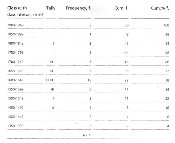
Statistical treatment of anthropometric data |
||
| Content 1.Statistical treatment of anthropometric data 3.Statistical analysis of data for percentile calculation 4.Percentile calculation by arithmetic process 5.Percentile calculation by using graph 6.Percentile calculation by using formula 7.Smoothening a frequency distribution 9.Statistical implication of collected data
|
Designing for a single person demands his dimensional variations to be well accommodated. When designing for mass use
|
and for unknown individuals, one of the most relevant statistical interpretations and considerations is the percentile value of the collected data.
|
Percentiles |
||
|
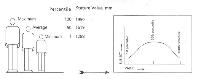
Percentiles are the statistical values of a distribution of variables transferred into a hundred scales. The population is divided into 100 percentage categories, ranked from least to highest, with respect to some specific types of body measurements. The first percentile of any height indicates that 99 percent of the population would have the heights of greater dimensions than that.
|
Similarly, a 95th percentile height would indicate that only 5% of the study population would have greater heights and that 95th percent of the body population would have the same or lesser heights. The 50th percentile value represents closely the average which divides the whole study population into two similar halves with one half higher and another half with lower values in relation to the average value.
|
|
|
Schematic presentation of percentile distribution with the help of stature value of a selected population
|
||
| Video tutorial | ||
Statistical analysis of data for percentile calculation |
||
|
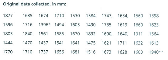
The calculation process is described here is an example, taking the stature values of a group of 50 individuals. This might help designers in the compilation of special data collected by them for
|
special purposes, where ready sources are not available. It will also help them understand the method. Below is a reference data set to get aquaint with the calculation procedure.
|
|
 |
||
|
Stage I
|
||
|
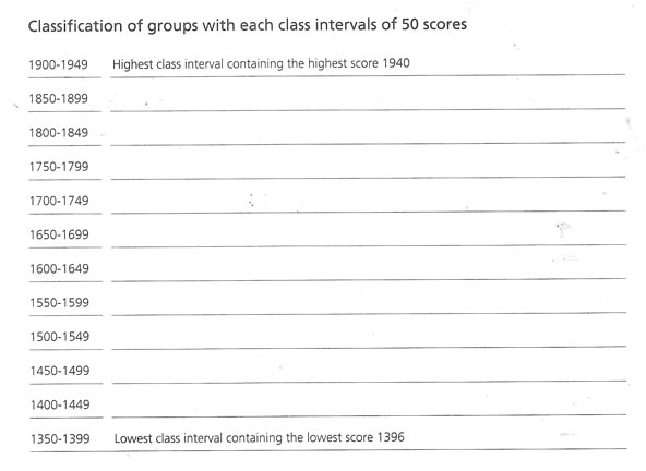
Identification of two end values. The lowest score* is 1396 and the highest score** is 1940.
|
||
|
Stage II
|
||
|
Arrangement of classes. The difference between the highest and the lowest value, 1940 - 1396 = 544 may be divided into manageable blocks, say if 50 individuals are in this group then, 544 / 50 = 10.88n - 11class of each class interval having 50 scores. For ease of calculation a round figure |
of 350 instead of 1396 may be consideredas the lowest value of the lower class. Starting from 1350 with class intervals of 50, classes should be arranged till the uppermost class attends the highest score obtained in the original data. Here we get 12 classes as the following class distribution.
|
|
 |
||
|
Stage III
|
||
|
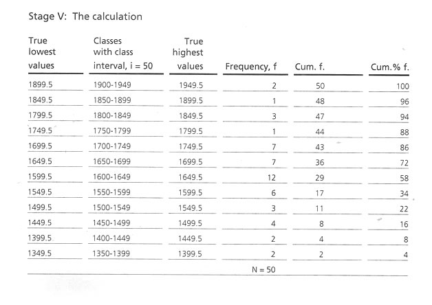
Refinement of the class intervals and frequency distribution of scores are according to the classes and calculation of cumulative frequency (Cum. f) for each class. The 'Cum f' for the lowest score containing class will be in the same original frequency and the rest will be by adding
|
gradually the lower class interval's Cum. f' will be the total number of the sample size. Cumulative percentage frequency (Cum% f) is the next step to calculate, corresponding to the 'Cum f' considering the highest 'Cum. f' value as 100.
|
|
 |
||
|
Stage IV
|
||
|
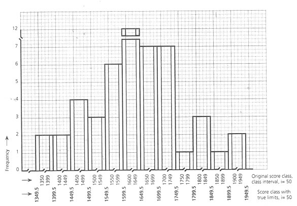
If we look at the bar diagram of this distribution, then if any individual score is between 1399 and 1400, it is not counted either in class 1st or in 2nd. To accommodate this in the proper group, the mid1-1 point between the upper value of the lower class and lower value of the next higher class may be considered as the true limit of these two class intervals. Hence, the true lowest value of the class 1400 - 1449, would be 1349.5. The same would also be the true highest value
|
of the class 1350 – 1399. If there is no possibility of its happening in manner or if that minute consideration is not required, this step may be avoided in calculation.
To sort out the true lower value and higher value of any class, this would be 0.5 less than the original lower value and 0.5 more than the original higher value. By this it could be said that an individual score of 1399.4 would be counted in the true class of 1349.5, and 1399.7 would be in the class of 1399.5 - 1449.5. |
|
|
Bar diagram of a score distribution showing the true upper and lower limits of the regular score classes |
||
|
|
||
Percentile calculation by arithmetic process |
||
|
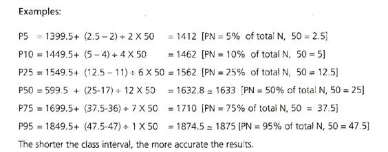
P25, the 25th percentile value corresponding to 'Cum% f' falls in the class of 1550 -1599, i.e. the true class of 1549.5 - 1599.5 and correspondingly to the 'Cum% f', 25th percent position of the cum f, will be the 25% of the total N, 50 = 12.5th 'cum f' ranl score. Below 1549.5 score limit there are 11 person say, 22% of the population. To get the 25th percentile figure of this score we have to go to the score that corresponds to the 12.5 cumulative corresponds
|
to the 12.5 cumulative frequency levels, that means, 12.5 - 11= 1.5 f score in this class. The class 1549.5 - 1599.5 has a frequency of six. Each frequency carries 50 + 6 = 8.33 score value. Hence, adding 12.50 to the lowest value of this class 1549.5, 1549.5 + 12.5 = 1562 mm would be the 25th percentile score of this population group 75% of this survey of the population mentioned above will have larger stature than this value and the rest will lie below this level.
|
|
Percentile calculation by using graph |
||
|
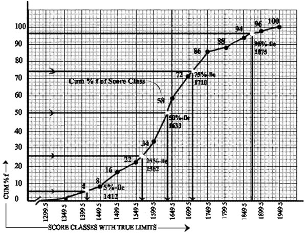
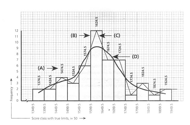
A curve with Y axis of cumulative percentage frequency and an X axis of the true limits of the score group as shown in below Fig, can also be used as a graphical method of getting the required percentile values. Drawing a horizontal
|
line from the required percentile point of Y axis to the curve and from that meeting a vertical line to the x axis would give a corresponding score and that would be the respective percentile value.
|
|
|
Percentile calculations by cumulative percentage frequency curve
|
||
|
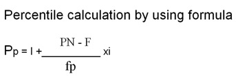
Pp = required percentile rank I = lowest value of the class intervals PN = cumulative frequency in relation to the Pp point F = cumulative frequency below the lowest value of Pp class fp = actual frequency of Pp class i = class interval score |
||
|
The median is the midpoint of a score of a score arrangement from the lowest to the highest order, which would be the 50th percentile figure. In the above case, it id 1632.8, and its graphical representation is shown in Fig below Roughly, for the purpose of a survey of anthropometric data, the subject number is vast and hence, in references, when addressing the 50th percentile value, the term 'average' is also used.
|
||
|
Graphical representation of the distribution patern of scores of a sample surveyed (reference data used here in ).
|
||
|
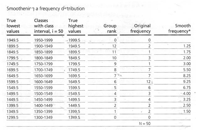
*Calculation for smooth frequency of a corresponding group: (2 times the original frequency of the original group + Frequency of the group just above the original group + Frequency of the group just below thw original group) divided by 4 |
||
 |
||
|
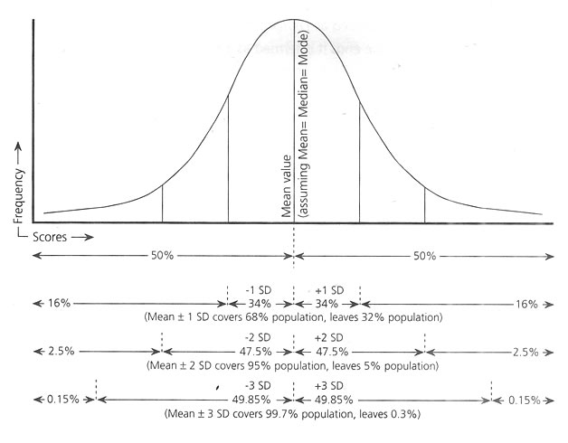
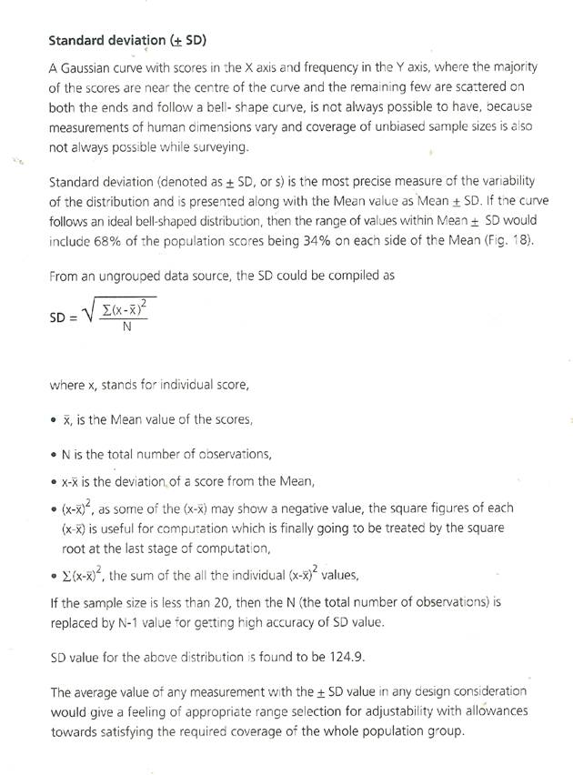
Bell-shaped "Gaussian Curve", the ideal sample distribution, showing Mean value and +SD relations.
|
||
Statistical implications of collected data |
||
|
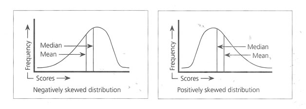
When the distribution of variables perfectly produces a symmetrical appearance, then only the Mean and 50th percentile value would coincide at the center of the curve. But normally, due to the Unevenness of the collected data, the arithmetic
|
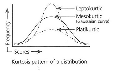
mean and median the 50 th percentile value do not match and the center is skewed (Fig below), negatively and positively. Depending on the width and height, the curve follows Kurtosis, Figure below.
|
|
|
Probable skewed distribution |
||
|
If most of the scores concentrate near the mean value then the curve points upwards and is termed as Leptokurtic. If the curve follows a short
|
height and spreads towards both the ends it is termed as a platikurtic curve. The normal bilaterally symmetric curve termed as Gaussian curve would always be mesokurtic.
|
|
 |
||
|
Anthropometric data are normally presented in percentile figures with range of minimum and maximum values, and sometimes with Mean ±
|
SD understands the data distribution pattern in a particular study population group. It helps in selecting the required data of design relevance.
|
|